Today I decided to branch out a little bit and play with some electronics. I lack any and all relevant knowledge or experience so I started very small. I picked up a basic soldering toolkit and a kit to build a "Game of Life" made up of some LED's placed on a circuit board.
The game of life is a simple programming trick that let's you see how individual cells live and die depending upon their proximity to other live cells. The cells are represented by the 4x4 grid of LED's that are provided in the kit that I used. You can see them there lying on the desk.
The first step was to insert the resistors. There was 16 that came with the set. Every one had to bent like a staple and threaded through pairs of tiny holes.
I found it very efficient to insert them as a bundle, soldering the connections and trimming the extra all at one time.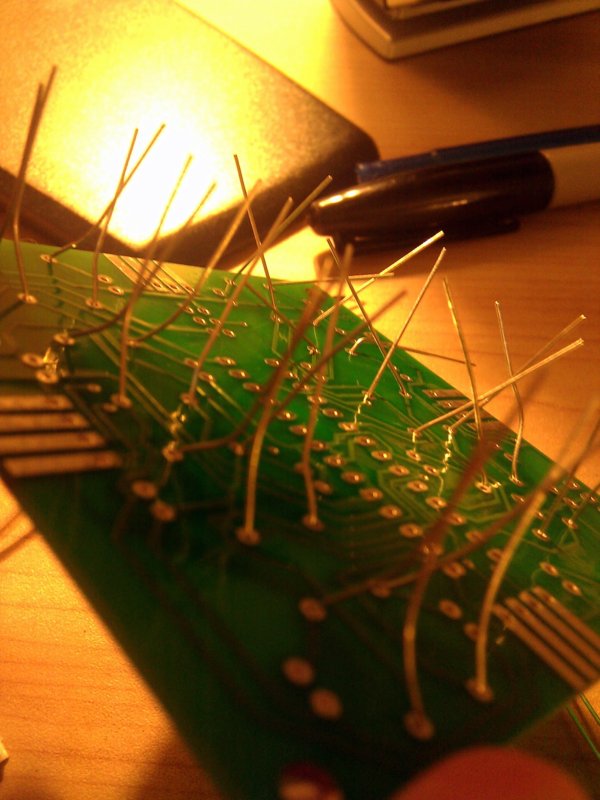
The chip fixture was the hardest to do by far. I think there were at least 16 tiny pins that I needed to solder.
My weapon of choice.
Time to add the lights!
A little bit of juice...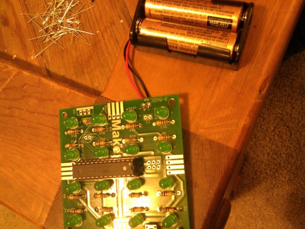
And viola! I've created life.
The action in real-time.
Sunday, March 04, 2012
i've created life!
Thursday, June 16, 2011
want to get hired? here's some advice from some random guy!
Okay, so the last eight months of my life were spent searching for that perfect job in the games industry, you know, any job. If you've tried seeking industry positions this past year, you might know just how frustrating a process this can be. The economy is improving at a snail's pace and it's not like we're getting any younger here.
That being said, I feel like I've honed my job searching process down to its essentials and I'm happy to share some of the more successful elements with any person who is desperately seeking employment like myself.
So, you're seeking employment and you don't know where to start? Some suggestions:
- Your relevant work in a format that is easy to parse through
- A detailed written description of all of your contributions to your work (I am complimented on this regularly, it surprised me just how much companies love these things)
- Pictures of everything. Pictures are easy to take and easy to post, and as the old saying goes, "Pics or it didn't happen."
- If you've got the time to do it, take a video of your work using a program like FRAPS and upload it to youtube. If the video's quality is high enough, it gives your portfolio an extra special edge over the competition.
- Your resume, in a format that is readable online and in a format that is downloadable.
- Your contact info, as much of it as you can think to post.
- Keep it short. I cannot stress this enough, these guys get several dozen if not hundreds of applications each month, there's no way you're going to get noticed if your letter is too long. I'm speaking from experience, the improvement that I witnessed from shortening my letter from 750 words (LONG!) to 450 words was ridiculous. Just stick to the facts, tell them a few things that you couldn't cover in the resume, why you like them, what you think you can do for them, etc. Don't repeat things from the resume unless you think they really need stressing.
- Link to your portfolio. Since we're living in the digital age and we're applying to gaming companies, I'm assuming that you're sending everything via email. Make sure to link to your portfolio at least once in the letter, if not twice. I use two links in my own letter, one in the first paragraph (in case they're merely skimming and want to get to the good stuff), and one in the last. I saw four times as many hits when using this approach as I did from my old, too long letter.
- Again, list all of your relevant contact info.
- Try finding the hiring director's name and email address, and make sure to use it in the letter that you send them. If the studio has a phone number, try giving them a call; sometimes they will refuse to give you the contact info you need, sometimes they won't. And for the love of god, spell the name correctly!
Sunday, December 12, 2010
a new website is up
It was pointed out to me earlier today that I haven't updated my blog in quite some time. I think my updated website makes up for it. I threw in all the bells and whistles, and since I'm still a novice I can only assume I threw in a few handfuls of bugs as well!
Wednesday, September 01, 2010
pax could not have possibly happened a year ago
It's my second year, and I still feel like I haven't properly planned for the event. I'm more grounded this year than I was last year, I know what to expect. Rachael and I are planning on hitting the larger panels (the keynote, the Q&A, D&D with Wil Wheaton) as well as spending adequate amounts of time on the expo floor. I'm going to try to make my way upstairs a few times for the sake of Magic the Gathering with friends and there's no way in hell I'm missing Jonathan Coulton again this year.
Seeing as how I plan on spending so much time in line with my fellow gamer this year, I thought I'd spice things up a bit. My laptop is coming with me as are my Xbox 360 controllers and a wireless receiver. I packed that thing with every last good NES, SNES, and N64 game I could find and I even spent the night setting up controller configurations for specific games. This means that the time spent waiting in line will now be spent playing Mario Kart and Goldeneye instead... Yea, life IS sweet!
Monday, July 19, 2010
experimental building concepts
I sat down and drew up a few concepts for possible future buildings for use in-game. They are pretty basic, but they depict a couple versions of a similar setup: two separate buildings that are connected by an elevated walkway.
The first picture shows a smaller building with an inset room for player spawning, etc., as well as stairs leading up to an elevated walkway. This is a more basic setup and it's nothing too crazy.
The second is my favorite of the two. It's a similar idea, two medium-sized cylindrical buildings that are connected via two passageways. The first is the blue passageway that runs underground. The green walkway is on the higher level, and it runs parallel to the first passage. Since there is a gap between the two passages, that means that players can run between them on the ground level. I like this layout personally since it allows for so many varied ways for teams to attack each other, and it's a bit more visually interesting.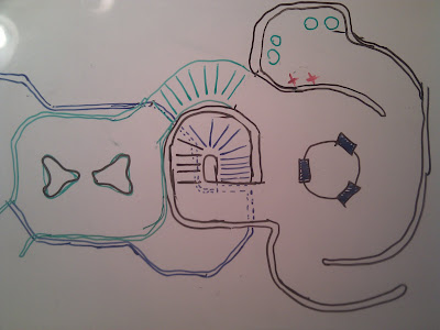
Saturday, May 29, 2010
fresh work!
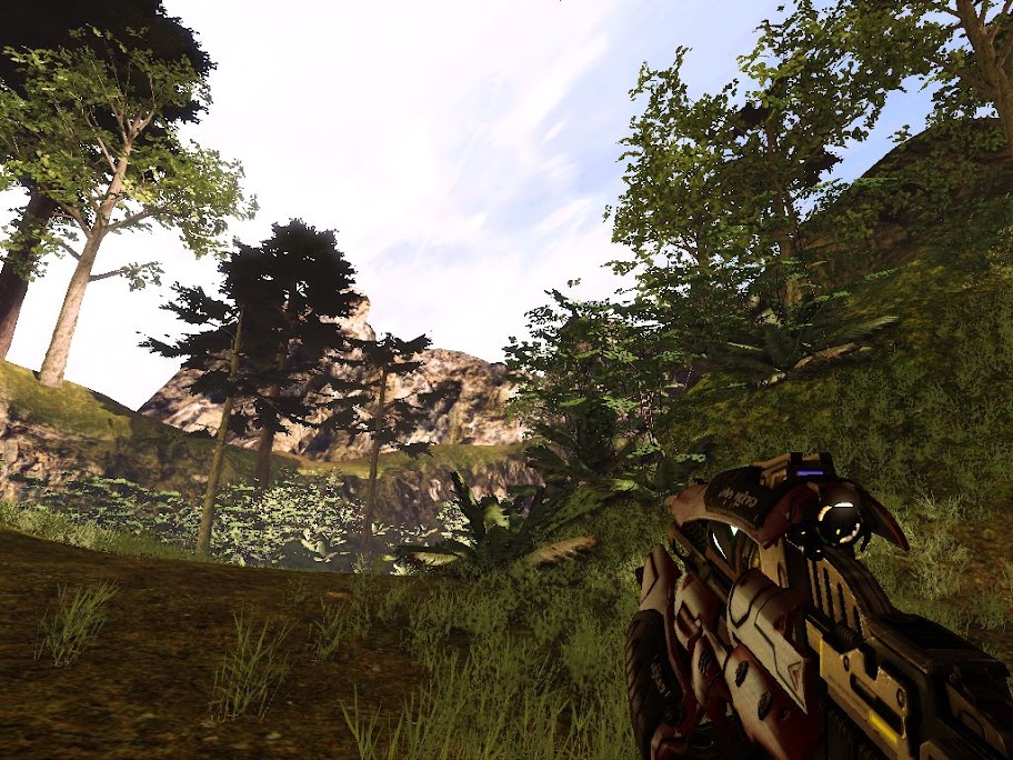
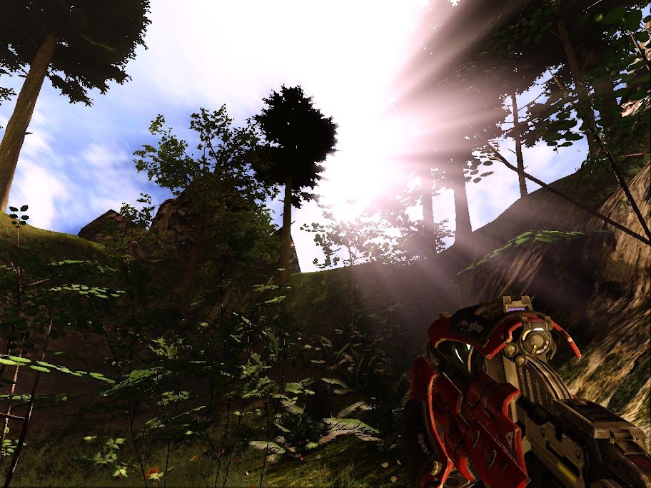
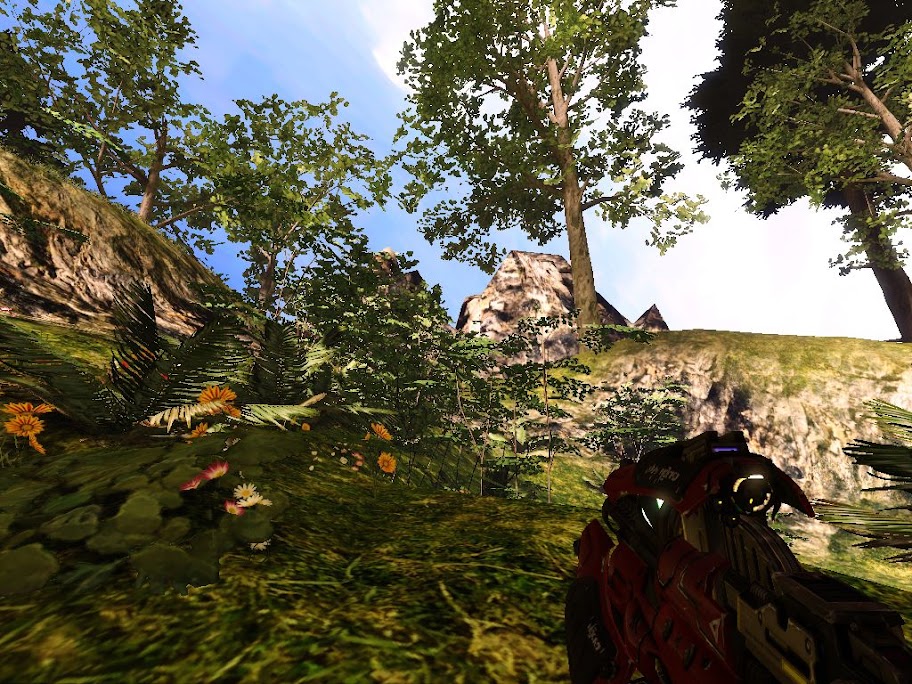
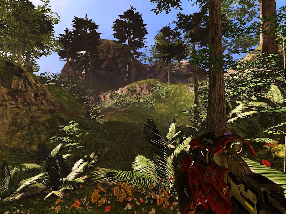
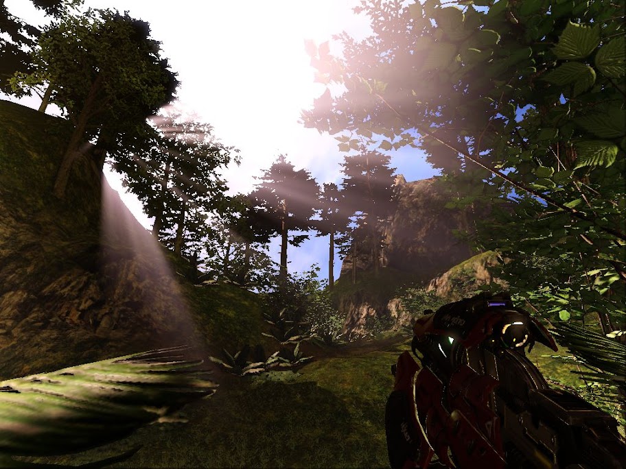
It's good to be able to post some work again. I've had quite a bit of work these past few months and it breaks my heart to say that there's really nothing that I'm allowed to talk about, leaving just a few trickles of things that I do on the side for me to post on. That's enough of that, though, I'm taking the time to educate myself with new techniques on a new engine. These screens are from a scene I whipped up using the Unreal Development Kit. I'm learning development of it as a bit of a side experiment right now but I must say I'm loving every bit of it so far.
The engine itself is far more powerful than anything else I've used, and the interface is a million times more intuitive than other traditional approaches. The scripting utility Kismet allows someone like me with absolutely zero programming knowledge to set up mundane triggered events with little effort, complex sequenced events, or even entire map parameters with a sleek and simple GUI. The engine itself is updated constantly, and the most recent iteration of it has given me some cool new effects for outdoor scenes.
Keep in mind that this scene I whipped up took me a just a few hours and this was my first attempt, so it's far from perfect, it's just a little something fun I had a chance to do.
Saturday, March 13, 2010
learning to do my own concept work
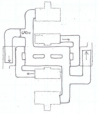
I'm working with a team of artists right now to generate content for the maps I'll be working on. The people on our team our very skilled artists and I've found that my own skills are, well, lacking! I'm trying to create a setting with a bit of an industrial feel, albeit whatever industry would look like four hundred years from now. With that I've come up with a few drawings I wanted to share for fun.
I think that it's extremely important for anyone interested in level design to try their hand at working on art in some form. When you think of it, level design really is nothing more than applied art; it's a way to guide the player through a visually interesting gameplay experience. Likewise, I think every game artist should give design a shot, to get a strong feel for how their assets will work in a more practical setting. It's this cross discipline training that I think helps to bring a team together, especially if everyone feels like their partners are taking the extra step to better understand their work.
I'm posting a few of my sketches for fun, and to let people who don't know what goes into making game see what some of the more crucial initial steps look like. Enjoy!




Saturday, February 20, 2010
a look at catchment
My last seven months or so have been spent developing content for Orion, an ambitious total conversion for HL2's Orange Box Engine. The mod itself is a fast-paced multiplayer game set on the fictional world of Orion, which is a fertile world that is reminiscent of an infant-earth. The multiple maps in the soon-to-be-released 1.2 patch will feature a number of locations across the planet; all of them a scene of the great conflict between the humans looking to Orion as a chance to escape their used-up, wasted planet earth, and the alien Altair who are similarly trying to escape a ruined home world.
The map I spent my time working on is called Catchment, and it takes place inside a water purification plant for one of the larger colonies on Orion. The Altair know that if they can disrupt or destroy this facility, they can effectively make refugees of dozens of thousands of humans and offset the human military's strategy in a major way.
The team spawns and flags are located at 3 and 9 o clock, and 12 and 6 o clock respectively. Each team has two routes out of their spawn: one main exit and one shortcut to their own flag which can be shut down via a clever keypad hack. Each flag room is accessible through two side entrances, or a shorter entrance that is only available to the assault class. A few pipes are placed higher up to let the assault class get a height advantage. There are choke points for support class defenders and more defensible positions for snipers to do their thing.
I hope you guys like it!
Thursday, January 14, 2010
tooling around with the unreal development kit
For fun I thought I'd try my hand at the Unreal Development Kit, a FAR, far superior editor to the Source SDK (sorry Valve, but it's true). The UDK comes loaded with a few textures and static meshes (models essentially) and a light version of Unreal Tournament 3 to test your creations with.
This was just a couple of days of effort last week and I have to say that I was blown away by what the editor was capable of doing:
